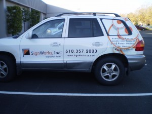
Cars are curvy which makes it extremely important that the design account for the curves and corrugation associated with the particular vehicle. Even if a template exists it will not tell you the diameter or dimensions of a curve so getting accurate measurements and the placement of these curves is critical.
REMEMBER: Measure twice and cut once!
Also cars have lines and seams that are not necessarily parallel. This makes it important that text and design elements are positioned so as not to fall on a seam, like the door jam. In addition, graphics and text should follow the body lines of the vehicle, which may not actually be a straight line. Vinyl may not adhere to certain plastic and rubber surfaces, so check around the window and grille area to be sure.
REMEMBER: Place design and text where it is readable not around door jams and windows.
Make sure to use high resolution graphics because although there are tons of images on the web, they are very low resolution and quality. Once you make the images larger than your computer screen you will see lots of distortion and pixilation.
REMEMBER: Use stock image websites or digital camera photographs taken with a 12 megapixel camera.
Avoid being too wordy. We often want to make sure we say it all and don’t leave anything out. The unfortunate truth is that too much information will mean that none of it gets read! Limit the amount of copy and be concise.
REMEMBER: Less is more!
Loopy fonts, lack of contrast and poor background color choices, as well a copy size that is too small are also cardinal mistakes. Try outlining the letters to make them more visible if needed.
REMEMBER: Make the copy size and color contrast stand out.
If all else fails or you need more design assistance give SignWorks a call at (510) 357-2000 or email us at info@signworks.us.com.

