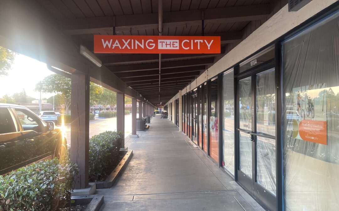
 SignWorks is excited to be working with Archetype and their client, Waxing In The City, at their location in Walnut Creek, CA. The interior graphics have arrived, and our installation crew is eagerly waiting for the green light to start the installation. The exterior logo blade sign was hung recently, and once the interior wall graphics are up, the project will be complete. This partnership and collaboration between Archetype and SignWorks shows the power of good communication, cooperation, flexibility, and shared ownership of the results.
Unified Branding Strategy: Bringing It All Together
Creating a unified branding strategy is key to making a retail space like Waxing In The City look cohesive and professional. It takes a lot of effort and coordination to develop branding and carry it throughout the entire space.
Understanding Branding
Some people assume branding is just a logo or some catchy color scheme and that’s just not true. It’s the overall look and feel of a business that helps it stand out and be recognizable. For Waxing In The City, this includes everything from the exterior illuminated cabinet sign. the logo blade sign outside and the interior vinyl graphics on the walls.
The Importance of Consistency
Consistency is crucial in branding. It helps customers recognize and remember the brand. This means using the same colors, fonts, and logos in all signs and graphics. At Waxing In The City, the same branding elements are used on the exterior sign and the interior graphics to create a unified look.
Developing the Branding: A Team Effort
Creating and implementing a branding strategy involves a lot of teamwork. Let’s take a closer look at the shared project management and coordination that made this project a success.
Collaborative Design Process
The first step in the project was to design the signs and graphics. This involved a lot of collaboration between Archetype, SignWorks, and Waxing In The City. The goal was to create designs that reflected the brand’s identity and met the client’s needs.
- Design Meetings: Regular meetings were held to discuss ideas and make sure everyone was on the same page.
- Feedback and Revisions: The designs went through several rounds of feedback and revisions to ensure they were perfect.
Fabrication and Production
Once the designs were finalized, the next step was to fabricate the signs and graphics. This is where the teamwork between Archetype and SignWorks really shined.
- Choosing Materials: The right materials were selected to ensure the signs and graphics were durable and looked great.
- Production Coordination: Both companies worked closely to coordinate the production schedule and make sure everything was made on time and measurements were exact.
Installation: Bringing the Vision to Life
The final step in the project was installing the signs and graphics. This involved careful planning and coordination to ensure everything was installed correctly and looked perfect.
- Scheduling: The installation schedule was carefully planned to minimize disruption to the business.
- Installation Team: SignWorks’ installation crew worked efficiently to install both the exterior illuminated cabinet sign and more recently the logo blade sign. The team is preparing for the interior graphics installation.
- Final Touches: Once the green light is given, the crew will install the interior vinyl graphics, completing the project.
The Power of Good Communication and Coordination
One of the key reasons this project was successful was the excellent communication and coordination between all parties involved.
Regular Updates and Meetings
Regular updates were crucial to keep everyone informed and on track. This ensured that any issues were quickly addressed and that everyone was aware of the project’s progress.
Flexibility and Problem-Solving
Flexibility was also important. Sometimes, unexpected challenges arose, and the team had to be flexible and find solutions. This included adjusting schedules, making design changes, and coordinating between different teams.
Shared Ownership of Results
Everyone involved in the project shared ownership of the results. This meant that all parties were committed to delivering the best possible outcome for Waxing In The City.
The Final Result: A Cohesive and Professional Space
The result of all this hard work and collaboration is a cohesive and professional retail space for Waxing In The City. The unified branding strategy ensures that the exterior and interior signage work together to create a strong brand identity.
Welcoming Exterior Signage
The exterior logo blade sign is the first thing customers see. It’s eye-catching and professional, making a great first impression and inviting customers inside.
Engaging Interior Graphics
The interior vinyl graphics continue the branding theme, creating a welcoming and cohesive atmosphere inside the store. These graphics help reinforce the brand’s identity and make the space more enjoyable for customers.
Conclusion
The successful collaboration between Archetype and SignWorks for Waxing In The City in Walnut Creek, CA, is a testament to the power of good communication, cooperation, flexibility, and shared ownership of the results. Creating a unified branding strategy takes a lot of effort and coordination, but the result is a professional and cohesive retail space that enhances the customer experience.
From the collaborative design process to the careful coordination of fabrication and installation, every step of the project involved teamwork and dedication. At SignWorks, we are proud to be part of such successful partnerships and look forward to continuing to deliver exceptional results for our clients.

