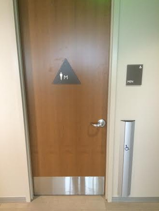
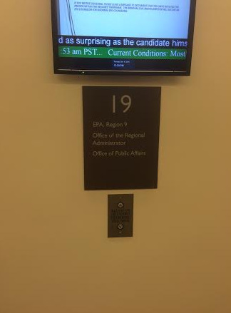
Located on the 20th floor at 75 Hawthorne Street, the Turner Construction Company is one of the most sought after construction management experts in Northern California. When this company needed office building signs in San Francisco, CA, its management team contacted the professionals at SignWorks. Since the inception of our working relationship with the client, we have created a broad range of signage solutions.
Examples of the products that we designed, manufactured and installed include ADA-compliant restroom signs, wayfinding signs, tenant identification markers, and directories. Additional products were evacuation maps and a variety of vinyl graphics. Since evacuation maps for office buildings in San Francisco, CA, must meet multiple regulatory requirements, we spent a good bit of time ensuring full compliance while also focusing on the practical nature of the overall display.
Working with Contracting Professionals and Architects
There is a distinct difference between working with a store owner and a contractor or architect.
- Planning ahead. It is not unusual for contractors to commission signage three, six or even 12 months ahead of the building’s opening. Although this practice makes it a bit more challenging for graphic artists to get a feel for the atmosphere of the place where the signs display – some of them are not yet even built – it is possible for our professionals to draw conclusions from blueprints and drawings.
- Lengthy submitting process. We understand that a lengthy submitting process is part of the working relationship. Building plans change, design styles undergo several revisions, and the signage has to follow suit. As a result, we keep detailed notes and records of the changes the contractor client requests, which allows us to go back and discuss pre-change request displays as needed.
- Matching the vibe. Call it atmosphere, ambiance or vibe; the building’s setting is designed to put consumers into a particular frame of mind. It is our job to create signage that emphasizes the intended atmosphere. We routinely mix and match material components, enhance color displays and adapt fonts to achieve this goal.
For example, the evacuation plan for the Hawthorne Plaza features a mid-gray board with silver elements and a wealth of information. To avoid confusion, we used color-coded graphics with white lettering that informs visitors about emergency procedures. By increasing the board’s size and working with several letter sizes, we succeeded in presenting multiple messages that target a broad range of consumers.
Thinking Outside the Box
Although ADA signs for office buildings in San Francisco, CA, must meet specific federal and local mandates, there is still room for a skilled designer’s touch that adapts the look of the markers to fit into the atmosphere of the building. Doing so eliminates the generic appeal of standard signs that you might find at an office supply store.
If you are currently in the process of designing a building or overseeing the construction of a project, talk to our professionals about the right signage design to complete the look that you strive to create. We work with you or your representatives to discover the right sizing, font selection, color options and ancillary choices. Contact us today to get started.


